GE Lightbulb Packaging
Packaging Design, Print Production, Branding
This project is a strategic rebrand of an existing lightbulb product line, focused on improving shelf impact, usability, and environmental responsibility. By rethinking hierarchy, color, and material use, the packaging system makes key information immediately clear while reducing waste through minimal construction and FSC-certified recycled paper. The result is a bold, system-driven solution that stands out in a crowded retail environment while reinforcing the brand’s sustainability commitments.
This project began with contextual research. I visited a local home improvement store and photographed the lightbulb aisle to analyze the real-world competitive landscape. The aisle revealed a sea of visually restrained packaging, mostly navy and white, with neutral typography and minimal hierarchy. Products blended together, and critical information like wattage, lumens, and bulb type required close inspection. Nothing commanded attention. Nothing offered immediacy. Nothing stood out.
From there, I defined strategic and practical goals: create packaging that stands out on shelf, reduces material use, and reinforces environmental responsibility through FSC-certified recycled paper. I approach packaging as a system, establishing hierarchy and structure before refining aesthetics. For this project, that meant prioritizing clarity and shelf impact.
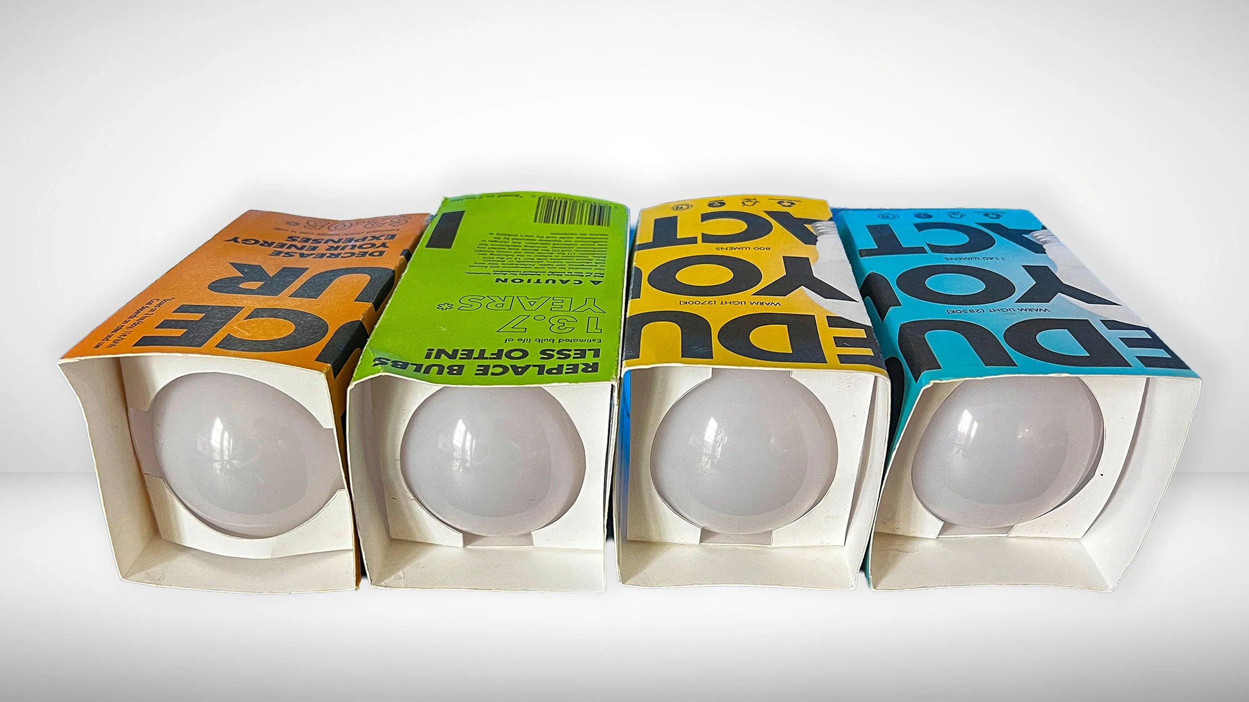
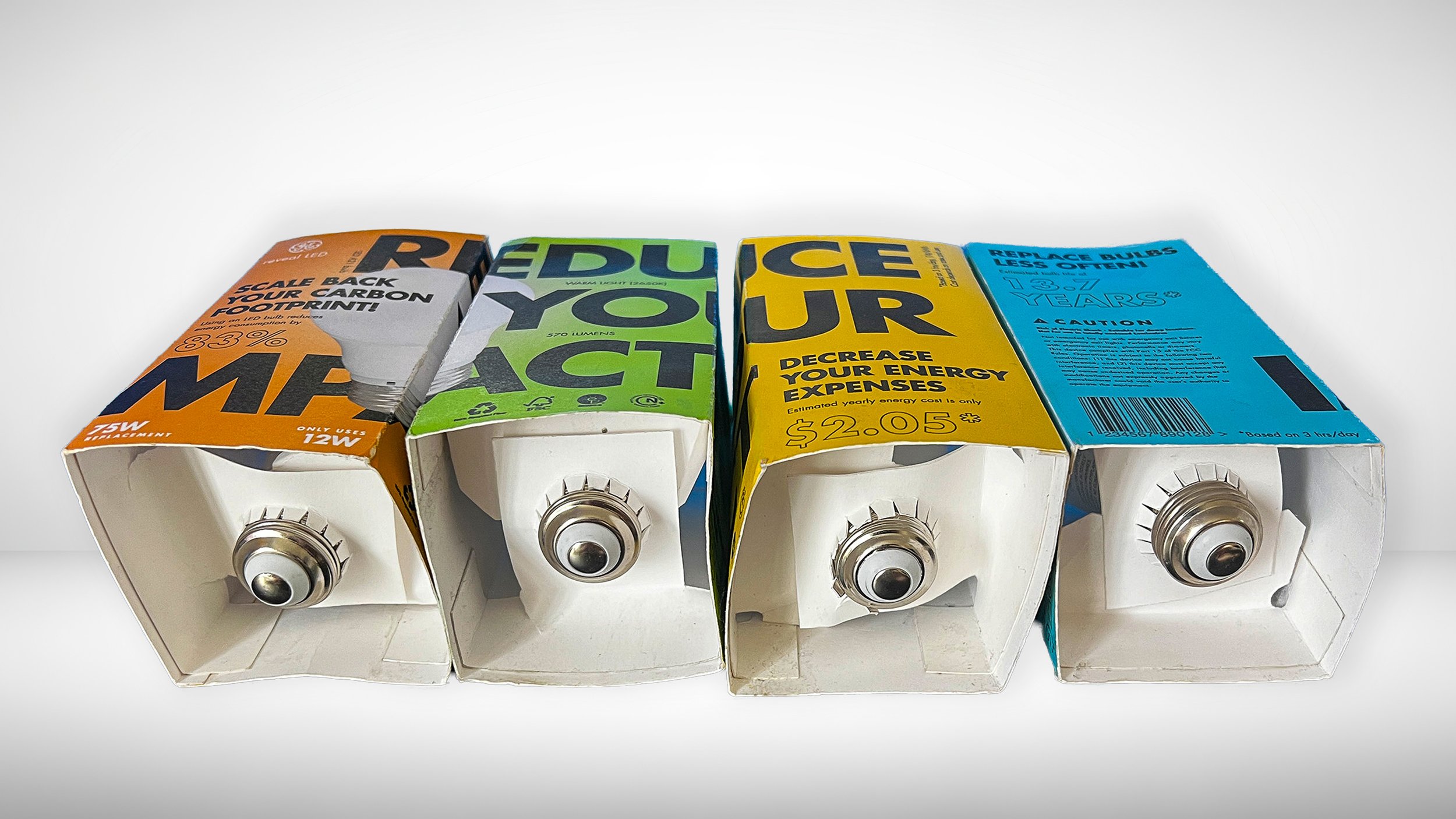
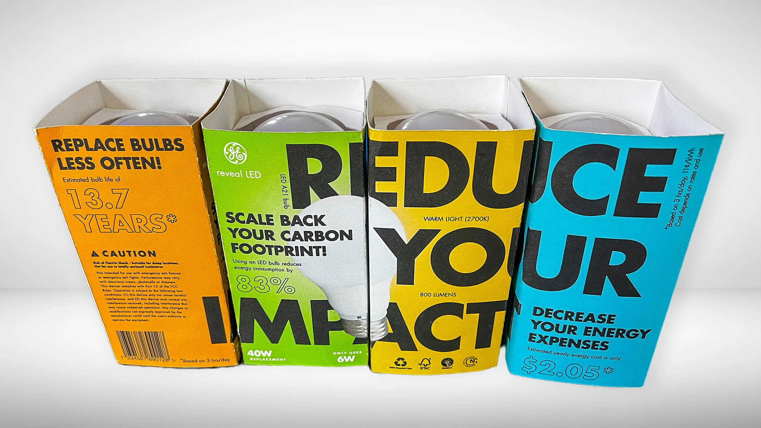
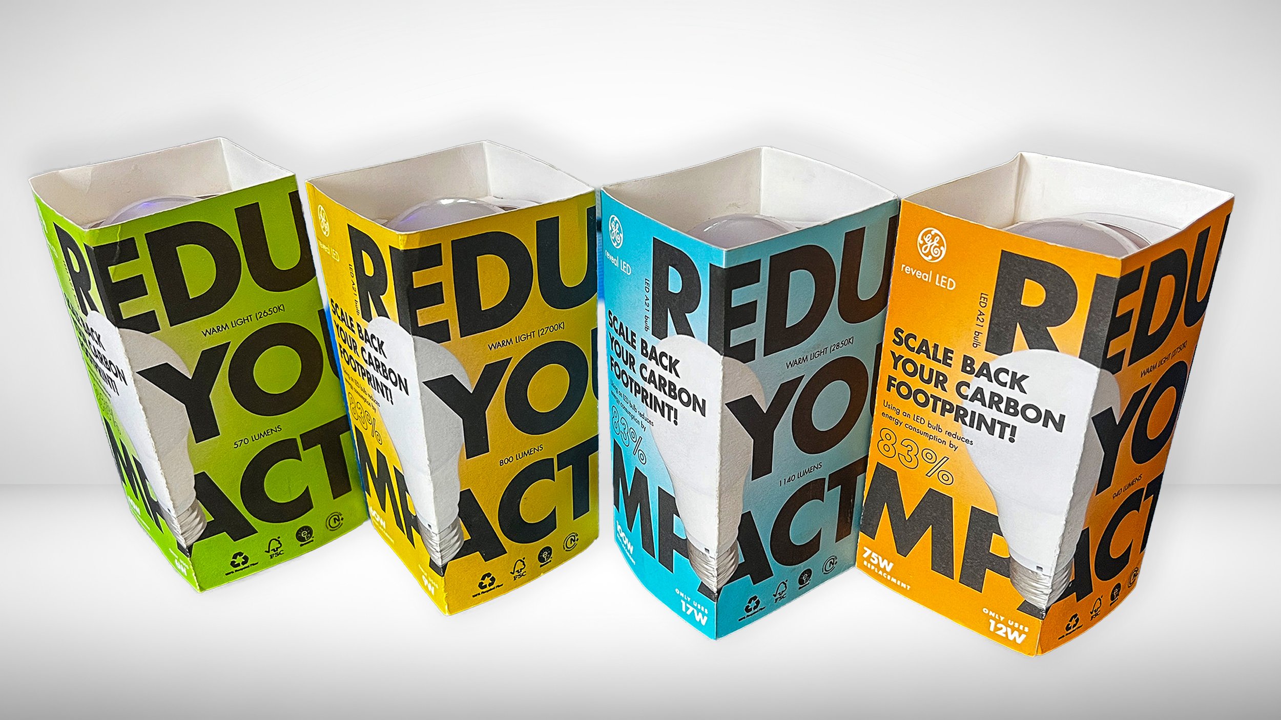
To achieve this, I introduced bold, high-contrast color coding to differentiate wattage and lumen outputs across the product line, enabling quick visual navigation. Information that is normally small or secondary was emphasized using scale and typographic hierarchy, bringing key details forward so they are immediately legible. The packaging was designed to use as little material as possible. The top and bottom of the box were removed, there are no plastic inserts or filler, and the only elements inside are folded flaps that hold the bulb securely in place. This approach communicates both sustainability and careful consideration of the product’s footprint.
Messaging and imagery were designed to wrap across multiple panels, ensuring legibility from different shelf orientations and accounting for imperfect in-store stocking. The result is a system-driven, materially efficient packaging solution that balances visual impact, functional clarity, and environmental responsibility.